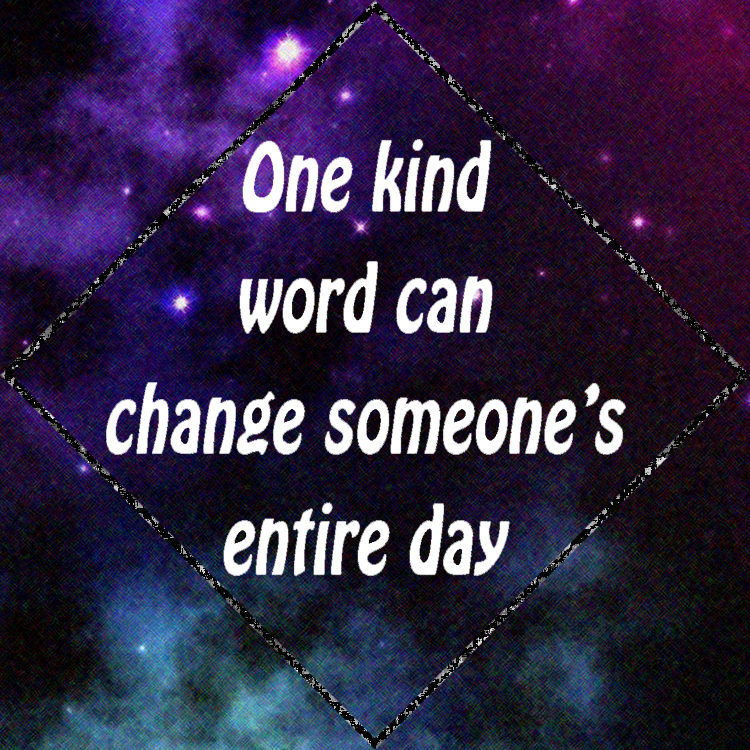
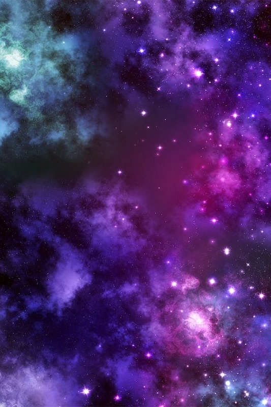
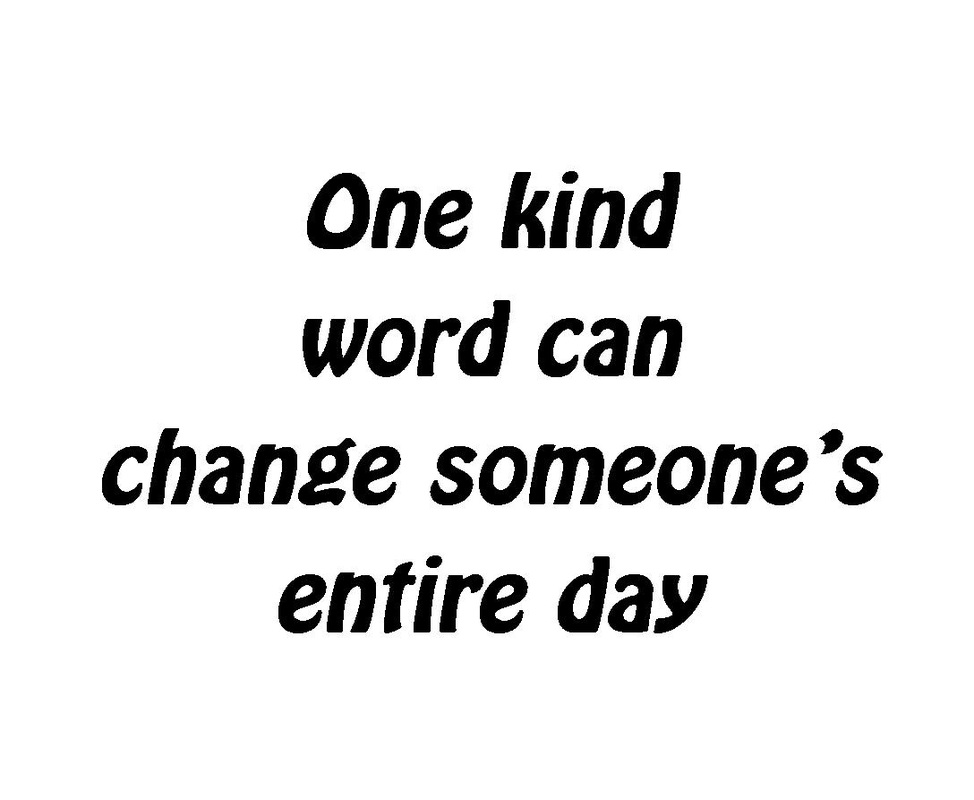
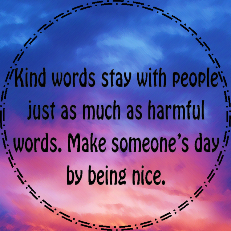
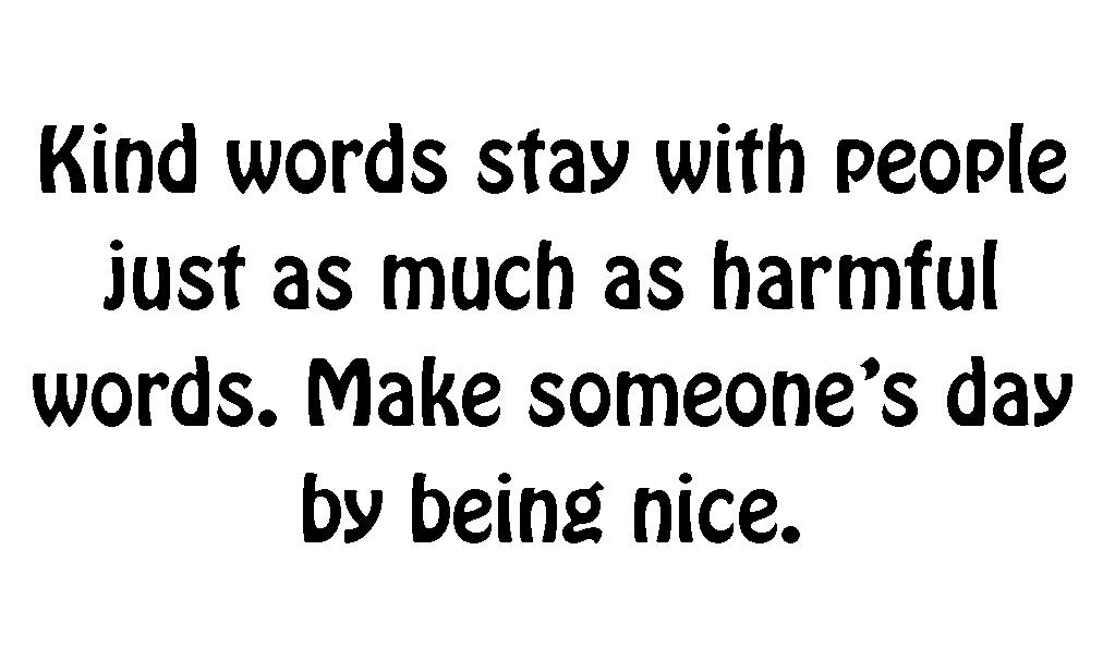
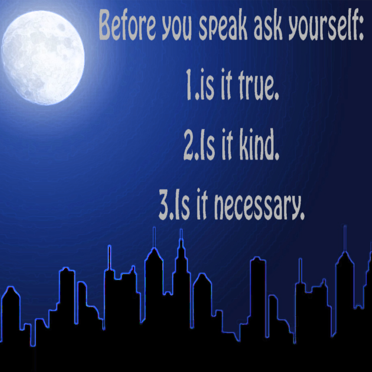
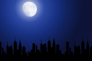
Anti-Bullying Stickers
For each of these stickers I found an aesthetically pleasing image from Google and added a few touch ups and filters to make them different. I then typed the text onto the image and for two of the three, created a shape for the border. During this project i just got more familiar with Photoshop tools and how to edit photos and combine layers.
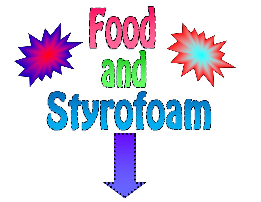
Extra Credit Project: Lunch Sign
This was another simple Project that i made in Publisher. I created Word Art of each individual word and added a gradience to it: the darker shade of a color on top and the lighter shade on the bottom. I also added an outline around the words to make them stand out more. After that, i created an arrow pointing down to where the trash can would be and did the same type of gradience as i did with the words and added a circular outline. Next i added these abstract shapes on the side of it and added a grediance of two different colors that faded from the outside into the inside. With this project i just got to use my prior knowledge of publisher to create this simple sign.
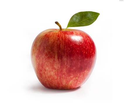
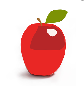
Learning about Illustrator: Apple
|
|
In this project what we did was take a photo of an apple and create painted layers in Illustrator to recreate it. This was a warmup into learning on how to use the program. I learned how to create layers and to separate them. it took a lot of time to be able to draw and angle the vectors around the shape of the apple. I also began learning on how to create vector drawing during this project.
SBRHS Logo
For this project i had to search the SBRHS logo and recreate it into a vector drawing. from there i had to color in the letter with a dark blue and outline it in a silver for my school's colors. This project helped me to understand how illustrator fills in vector drawings and how you can shape vectors.
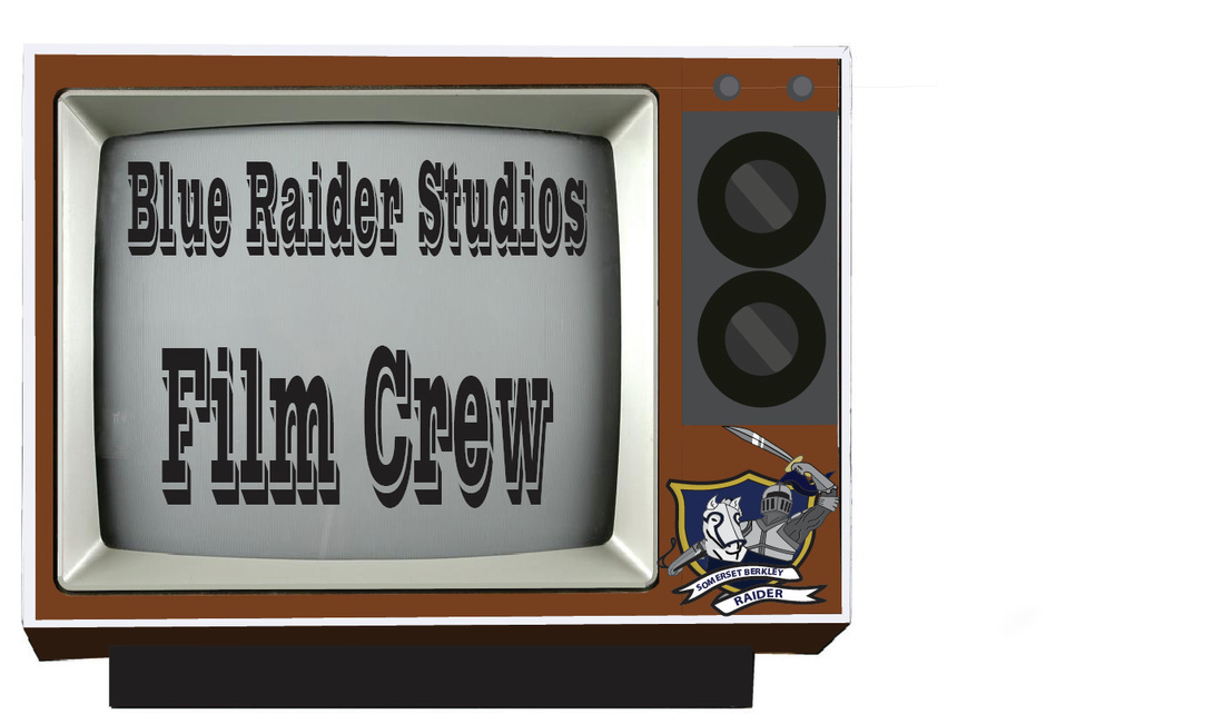
Blue Raider Studios Film Crew Possible Logo
For this project i found an image of an old TV and recreated it in publisher. In this project i learned how to make curves for round edges and how to use certain shapes and the difference between moving vectors and points how t transform the entire vector drawing. I also learned how to group certain objects together so they combine as one. I also learned how to show certain layers that i wanted and hide layers i didn't want. The Blue Raider was taken from a pre-made AI file but the rest of the image i made using vectors and filling them in.
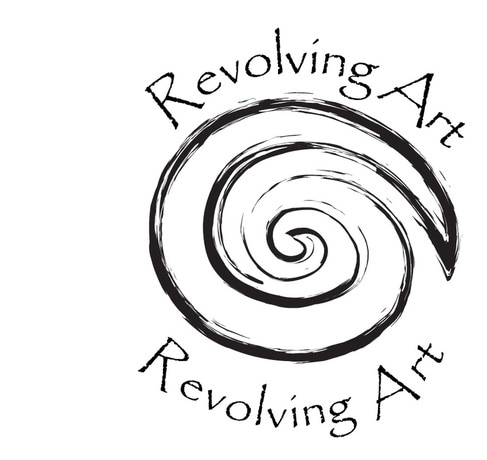
Revolving Art
This project was made for a company logo. We had a basic spiral to begin with and so i traced it with vectors to make it into a vector drawing. i spent a long time trying to perfect the curve angles and make it look nice. After i finally finished it i changed the outlining to one that looks hand drawn and sketchy to go hand in hand with the whole art aesthetic. Afterwards to created a curve on both the top and bottom of the spiral to add text on a path using the Papyrus font, again to make it look more artistic. This project helped me to be more comfortable with curves in vector drawings.
Update: I ended up winning the contest and my design was chosen to be the logo of the company.
Update: I ended up winning the contest and my design was chosen to be the logo of the company.
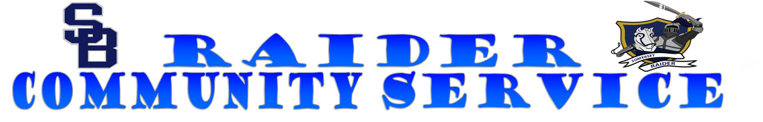
Community Service
This was a relatively easy project to do. we had to create a 30 by 5 inch poster for the community service bulletin. I simply created a word art image with publisher then transferred it to Illustrator where i added the SB logo that i had previously made and the Raider AI file that was pre-made. This project just combined my skills of using publisher and illustrator to create things. It also helped me to get more knowledge on how to print bigger item using two pieces of paper and how to change the printer settings.
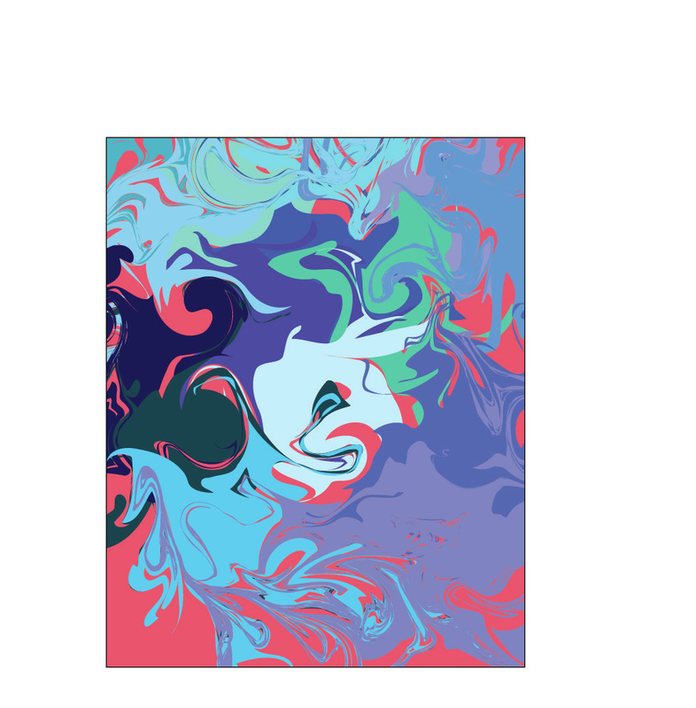
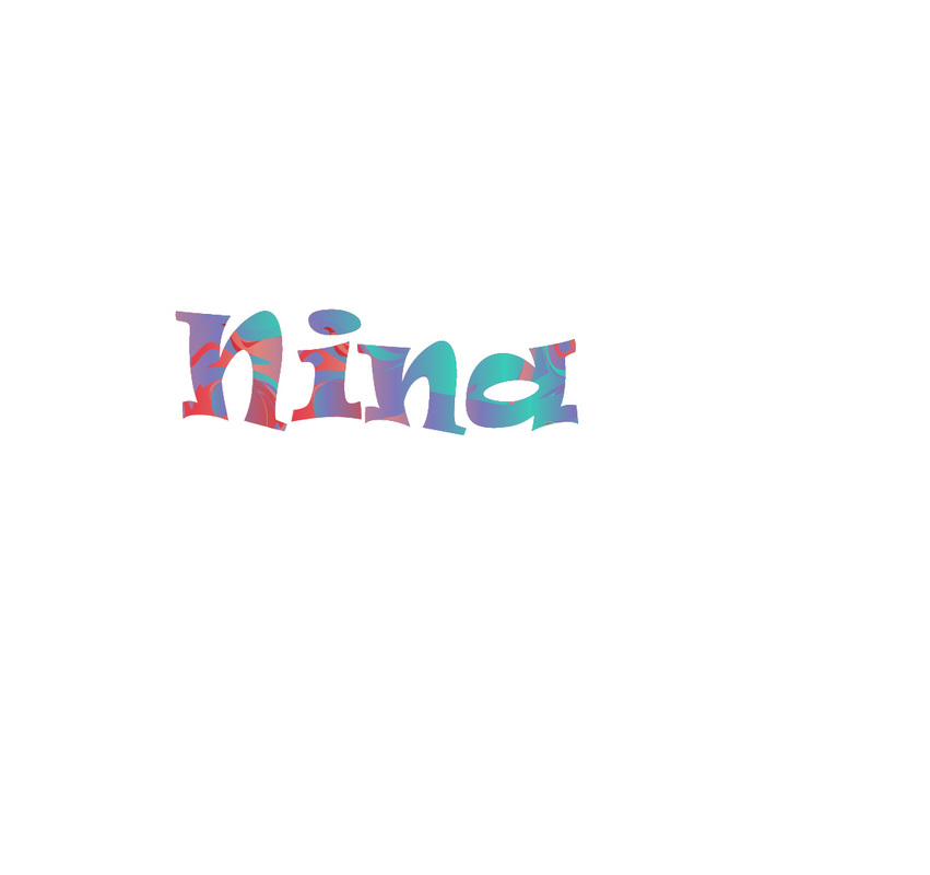
Marbled Background/Name
|
|
This project was straight out of the Illustrator workbook and was fairly simple once you understood the instructions. the first step was to create random shapes with different colors and have them overlap. After that, i had to use the swirl tool to mix and swirl the colors and shapes together until you couldn't tell they were shapes to begin with.Afterwords i had a little trouble figuring out how to clip mask the shape but i had finally figured it out. i simply created a rectangle with a black outline and clipped the mask and it fit in the shape. The next part of the project was to create your name using the marbled letters.I had to type my name using a big font and then outline each letter with vectors. i had to do each letter one by one but once i got the hang of it it was easy to do. i has to copy the letter and place it behind the marbled background then copy it again and paste it above the background them i could group the two object before creating a clipped mask. This project taught me new skills such as how to create a clipped mask and how to clip marbled backgrounds into shapes.
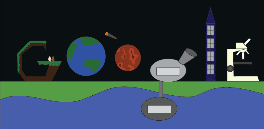
Doodle 4 Google
For this google contest i had to create a google theme using Illustrator. for this project i mostly used the pen tool and the shape tool to create what i wanted to create. for the G what i aimed for was a cliff where two people of different races were holding hands to symbolize equality. for the two os i created the earth and mars with a rocket ship show that we will advance scientifically in the future. for the g i made a base that is underwater and above ground so that it also shows advancement in science. the l is a futuristic building and the e is a microscope. these were all made using the pen and coloring them in. with this project i learned how to use the pen more and create other shapes using the pen.
Ticket
This ticket was simply made in publisher where I used word art and the gradient tool.
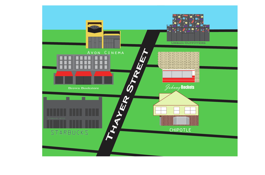
Thayer Street Map
This map was made in Illustrator and used several rectangles as a base. I tried to make every building as realistic as i could and placed them in similar positions on the Street.This project helped me get more familiar with changing the placements of anchor points and how to set different angles. It also helped me understand how to make things look more 3D and add depth to the buildings.
Dunkin Donuts Contest
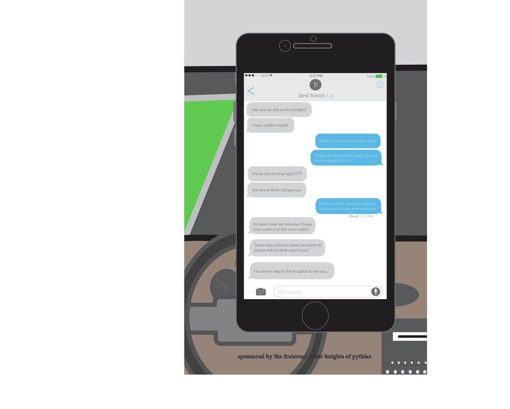
For this project i used a combination of the pen tool and the shapes tool. I used a picture for reference and tried my best to recreate the inside of the car. When i was finished i made the grass strips to make it look like the car was in a lane. The use of certain outline lengths and shaping helped me to better understand how to create structures using illustrator. When i was done with the vector drawing i saved it as a picture and went to Photoshop to use a filter in order to make the picture look like it was from a drunk driver's perspective.
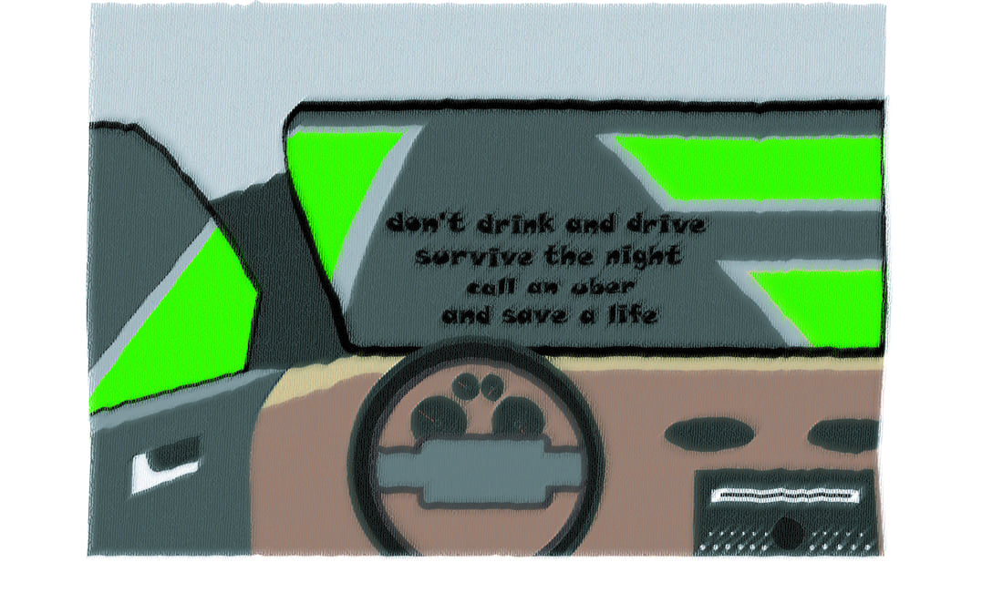
Knights of Pythias Contest
For this project i used the car that used in the Dunkin Donuts Poster Contest for the background. I then used simple shapes, mostly rectangles, to try to recreate what an IPhone would look like. I spent a lot of time trying to make it as precise as possible with little details like centering the contact name, adding the phone company and battery percentage, adding little effects in the camera, making little bumps on the side of the phone for the volume, ringer, and lock buttons, and by trying to make the text bubbles and close to the actual texting mechanic on the phone. I evenly spaced out all the text bubbles and i tried to make the typing bar as close to the real thing as possible adding the camera option and the voice recording button.
|
|
Ben-Day Dots Pop Art
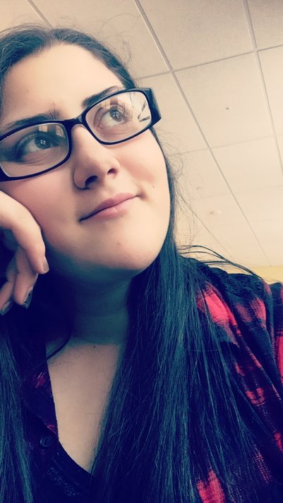
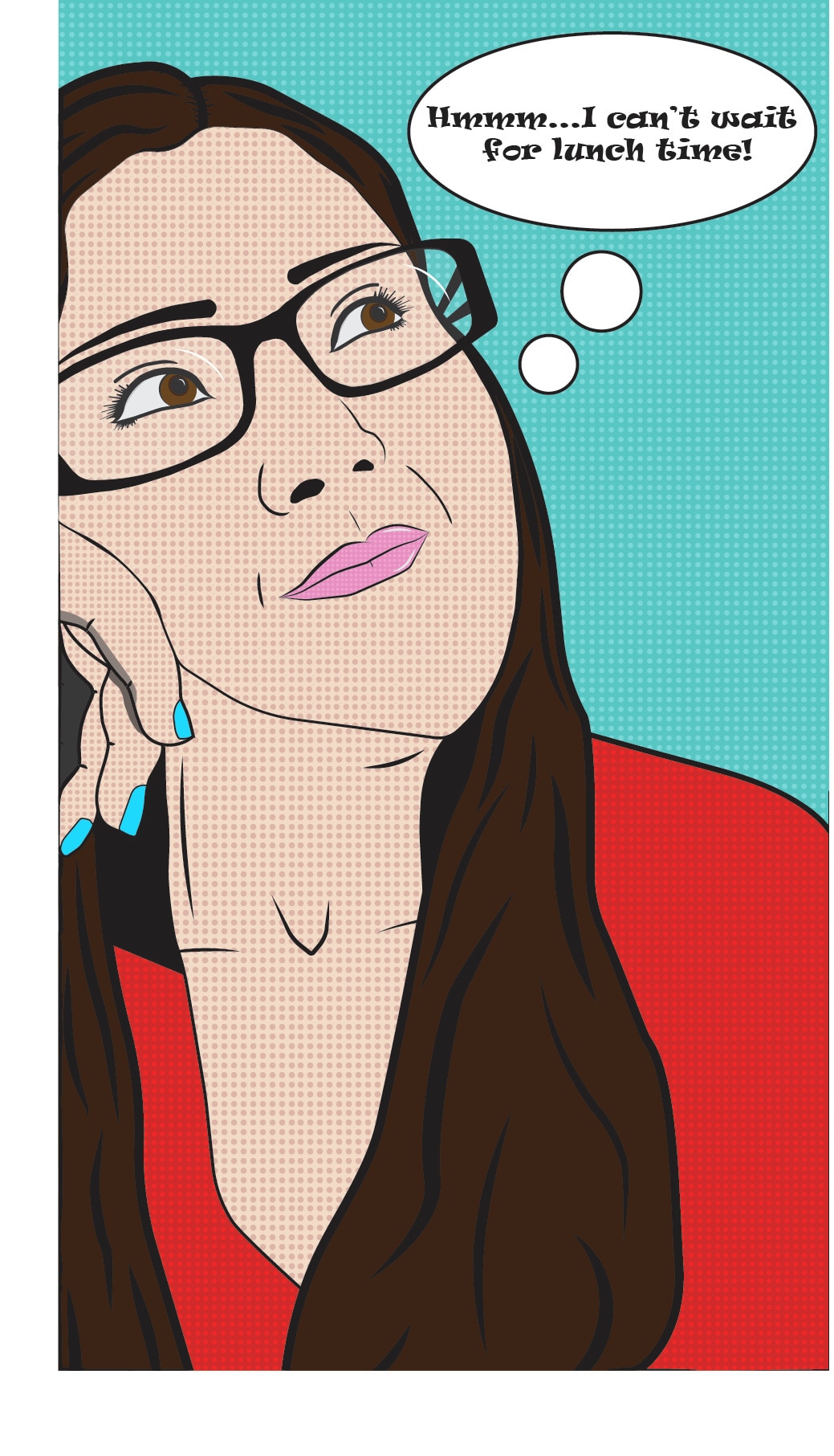
For this project i became more familiar with Illustrator and how to make the shapes i wanted using vectors. I created separate layers for each part of my face being lips, eyes, eyebrows, hair, face, shirt, background, hand, nose, and glasses. For each one i tried to make it as close to the original photo as possible. After i outlined, drew, and colored in all the different parts of my face, i created a swatch by putting the grid on. After the grid was on i made a small square and a circle inside it. In order to create the ben-day dots i had to pick a lighter color for the square and a darker color for the circle and added it to the swatch list. i then proceeded to fill in the corresponding shapes with their right ben-day dot color. I then scaled the dots so that they looked like the color i wanted them to be. At the end i created a thought bubble and typed in the sentence "Hmmm...I can't wait for lunch time!"
|
|
|
Curriculum Instruction Assessment Team Logo
For the Front of the shirt (right picture), i used the simple shape making mechanic in illustrator to for the circle. I used the blue raider AI file and pasted it in the middle of the shield i made using vectors. I created the graduation cap, books, laptop and art brushes using a template from photos i found from online.I created the music notes with lines and circles. For the back of the shirt (left picture), I used a paw print, dolphin, and cricket for a template and made a vector drawing for each of them. I then made a swatch of the designs by viewing the grid, creating a square and putting the design in the middle. I then used the text tool to Right "C.I.A." in all capital letters and chose a font that resembles the official CIA logo. I made the outline of the text black and the fill color of the letters each on of the swatches (the dolphin, cricket, and paw print). This project taught me how to create my own swatches and how to shape vectors.
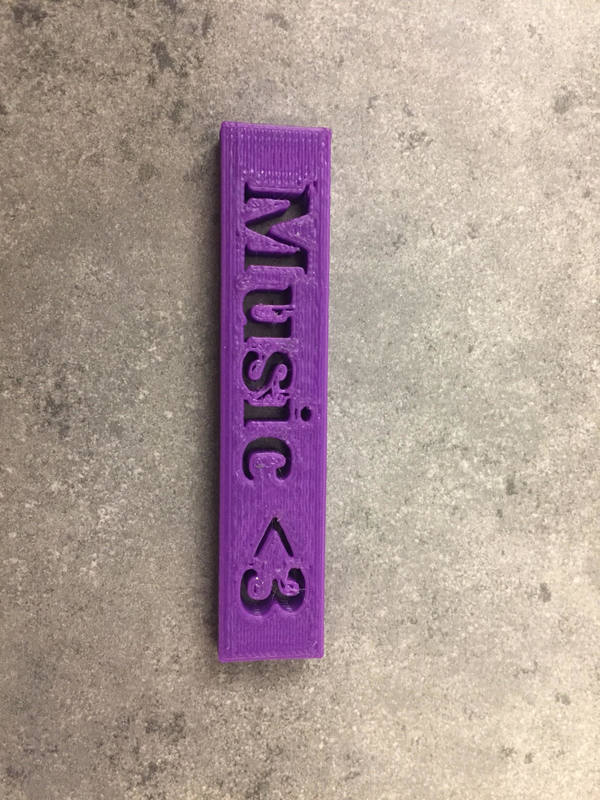
3D Printing Keychain (subject to reprint and change)
I used the program Tinkercad to make a 3D model of a two inch by one and a half inch keychain. I started out with a simple rectangular prism and created a hole using another block of text saying "Music <3" which allowed for the keychain to have that text cut out of the rectangle. I then used a circle and connected it to the rectangle in order to create a keychain loop. When i first printed it the loop was too small so i had to make the height of the loop to be the same as the keychain. This project taught me how to create 3D models.
|
|
|
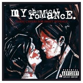
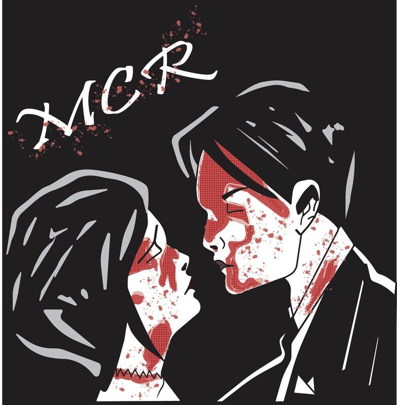
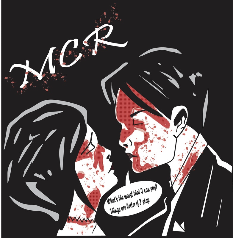
Ben-Day Dots Album Art
For this project, I used the template to the left for my album art. I chose this cover because the art already had people on it and already looked cartoon-y so i figured it would be cool as a ben-day dot project. For this project i created different layers for each of the parts of the Girl's face and the Boy's face. after i outlines all the basic parts i had to make silver outlinings in the black hair of the two people using the pen tool. Then i created the blood but using a shape drawn with the pen tool and adding an outline from the art brushes library. I also used simple lines that were outlined with a paint splatter affect to create the blood splatters in their faces. For the ben-day dots i viewed the grid and created a square and a circle in the middle to create swatches for the blood and the two lips on the people. When i was finished i created a black background and used the test tool to say the letters "MCR" which is the band of the album. I added some more blood splatters using the outline from the art brushes library. I also added a speech bubble saying some lyrics from the album, "What's the worse that I can say? Things are better if i stay." coming out of the mouth of the boy.
|
|
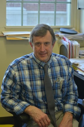
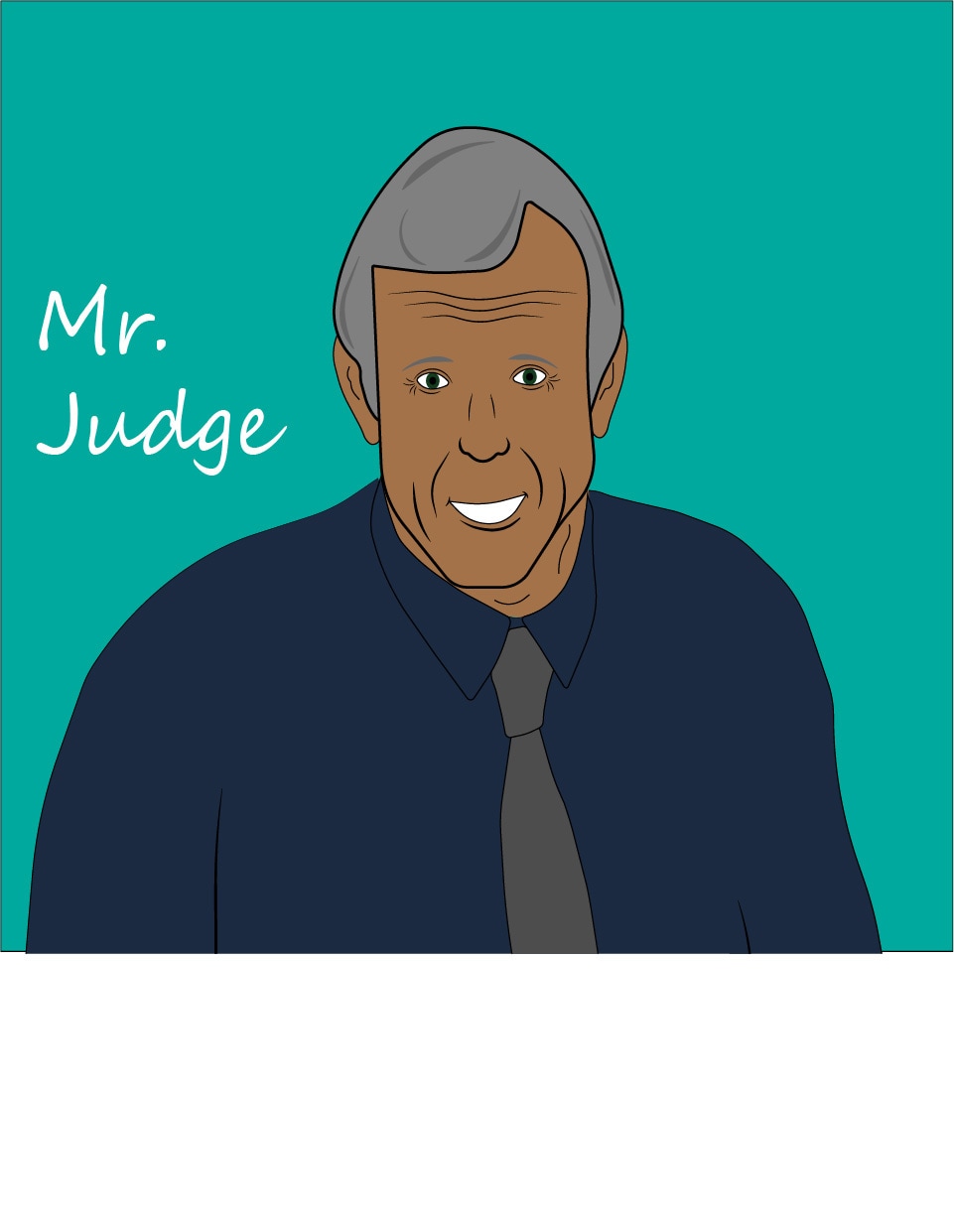
Guidance Counselor Drawing of Mr. Judge
The way I did this project was the same way i did the other Ben-Day dot projects. I started with a simple face and slowly added more layers to create facial features and colors from the original picture. When i was done created the facial features i worked on creating a more simple version of his button up shirt instead of creating all the wrinkles and plaid shaping. His neck and shirt are not my best work but i couldn't figure out how to complete it without it looking bad or not proportional. I have forgotten the pocket on his shirt but i don't think it's that big of a deal. His facial feature are kind of simplistic but for the male Ben day dot art i noticed it was much simpler for men than it is for women.
