Magazine Ad
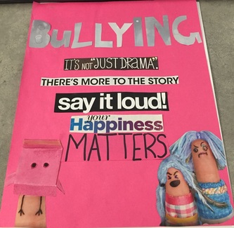
The assignment I was asked to do was to create a magazine ad using nothing but magazine parts and the objective was to describe elements and principles of design. To do this project, I needed magazines, glue, scissors, instructions, creativity, and construction paper. To create the ad, I found some ads in various magazines that sparked my interests. I cut them out and started to configure some sort of ad or message. I then decided I would do my ad on bullying and got some construction paper to put the quotes I found on the paper in a nice way. I then glued them done and cut out some letters for the title "bullying". The ad features some contrasting blue saying the word bullying, some quotes that I felt should be there to portray the problem of bullying, and some avatars of a person getting bullied or picked on. While I was doing my project Mr. Adams recommend that I should do a contrasting blue for the title to match the blue of one of the avatar's clothing. He also suggested that I cut out the letters for bullying instead of drawing small bubble letters. While doing this project, I learned the elements and principles of design and how to apply and recognize them. If I were to do this project again I would think ahead to what my ad could be and make my craftsman ship better than it is.
|
|
Flyers
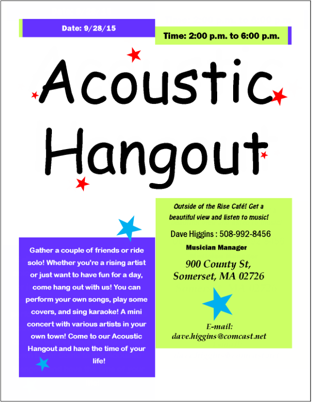
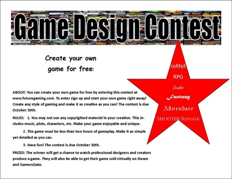
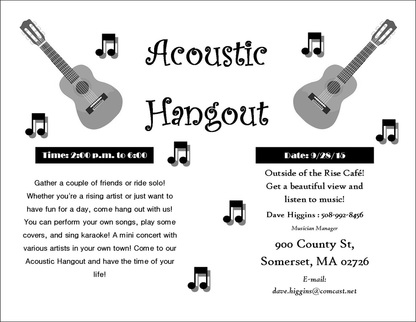
The assignment I was asked to do was to create three different windshield flyers for a business, festival, opening event, sale, etc. What I needed in order to complete this task was Mr.Adam's instructions and a computer. The first thing I did was pick a topic for me to make a flyer about. For the first flyer I chose a pre-made template, for the second I made my own and for the third I redid the first flyer in black and white. What I did to create my flyers was use a variety of fonts, shapes, and sizes to make the ad bold and creative. I also used clip art and Google to find picture that would support my ad nicely. When I was done, I converted the publisher file into a picture and posted them onto my website before printing them out. The first flyer is a handout for an acoustic hangout in the town of Somerset where I used colors and shapes to make it seem bright and fun. The second flyer is an ad for a game design contest that has multiple fonts and an organized and simple set of rules and directions. The third flyer was a remake of the first, being an acoustic hangout. It was in all black and white and I chose to do a landscape flyer with acoustic guitars and several music notes. I did not get any feedback from peers but my own feedback would be that I think I did a pretty decent job. I liked the template I chose and the flyers I created seemed organized and creative in my opinion. Although if I did this again I would try to find better pictures for my game design flyer. I would also try to think of a different topic that could create a flyer for.
|
|
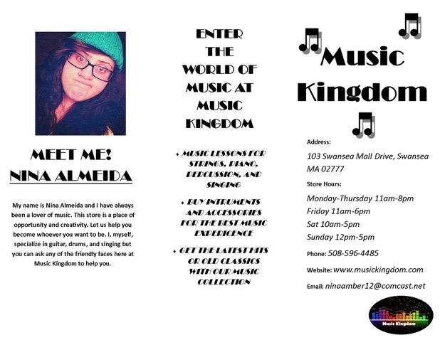
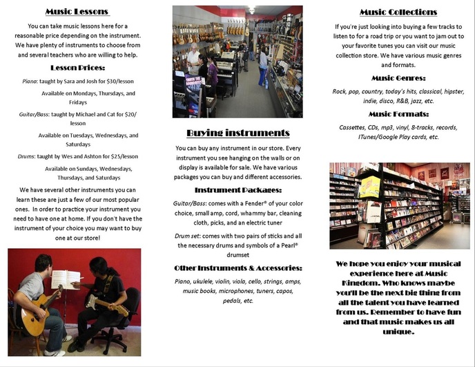
Practice Brochure
The assignment I was asked to do was to create a practice brochure of my own company before we went on the field trip. What I needed in order to complete this task was the internet and my phone for pictures and selfies. I also used clip art for the music notes. The first thing I did was brainstorm what my dream company would be which I figured out would be a music store where you can buy music and instruments and get lessons. This store is based off of the Ray Mullin Music store in Swansea. Then next thing I had to do was set up my brochure appropriately with all the correct spacing. After I did that I started to come up with a name and putting together all the information for my brochure. I even used Paint to create my own little logo that can be found on the cover. I also had to upload a selfie that I found on my phone and even added a filter using Photoshop. The whole brochure is a combination of the Broadway font and the Calibri font using different sizes and formats such as bold and italics. The only feedback I got was when I first printed it out and Mr. Adam's said that it looked good but I had to move some of the text over so it wouldnt get cut off. when I redid it I saw some grammar mistakes and decided to change them before my final reprint. If I were to do this again I would take the time to space my pictures out more evenly.
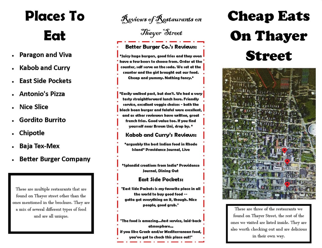
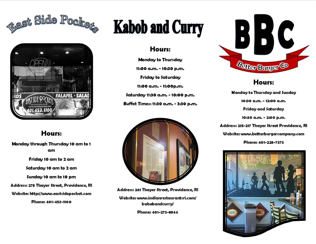
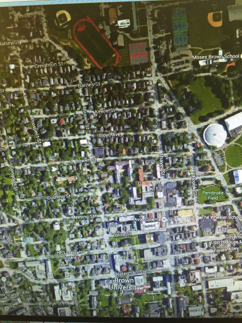
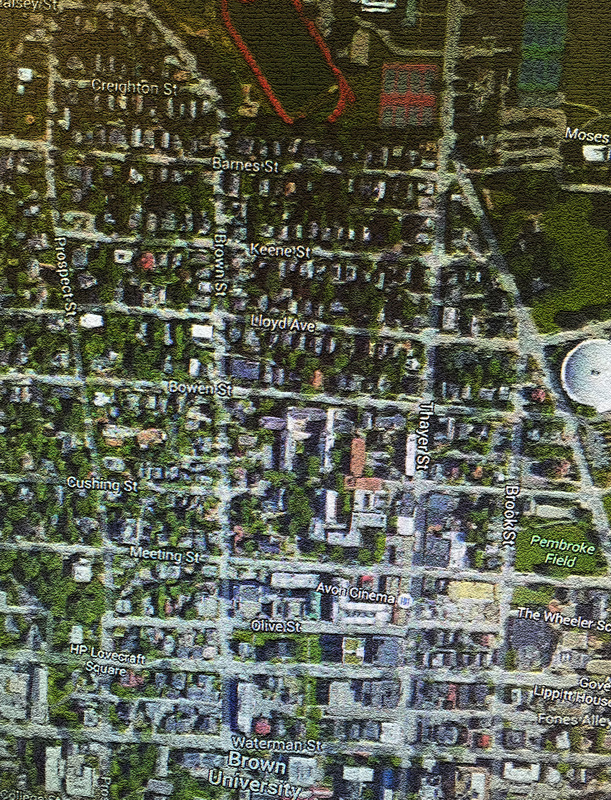
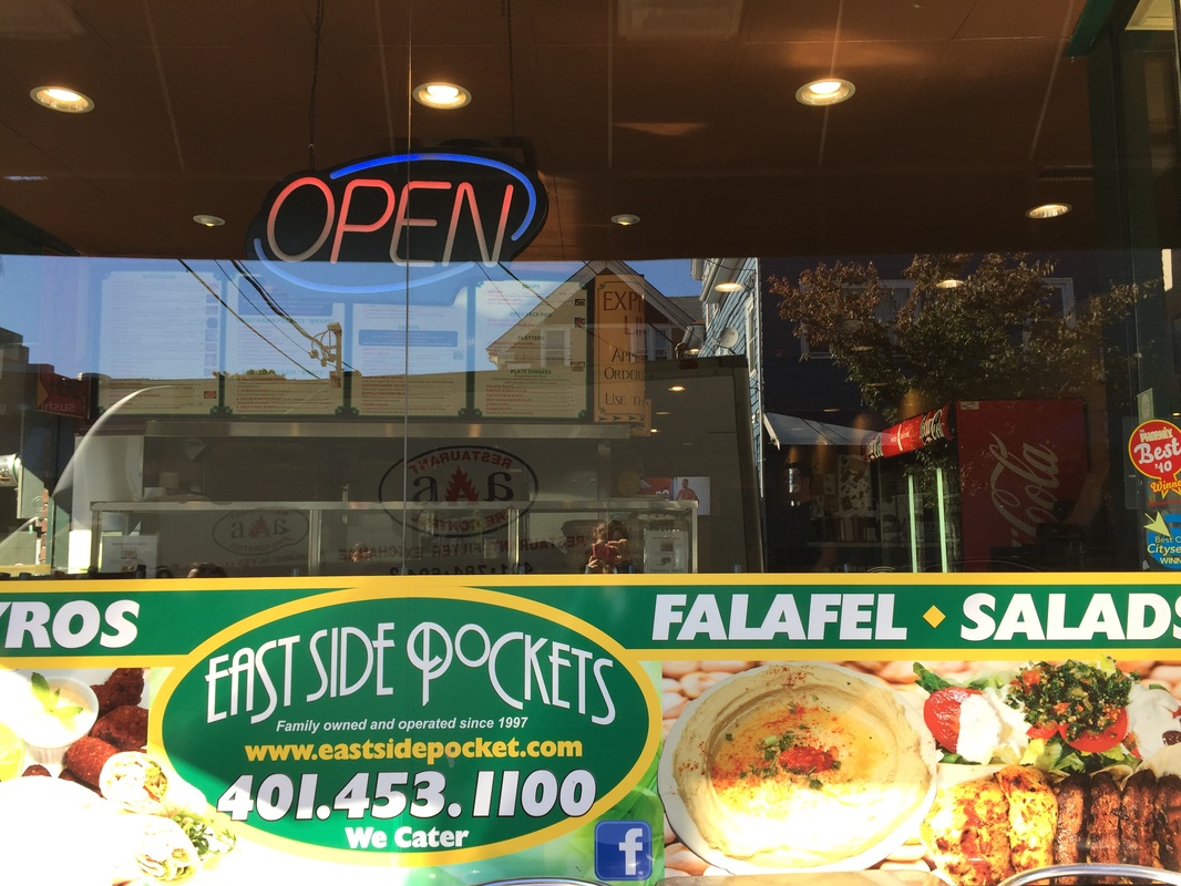
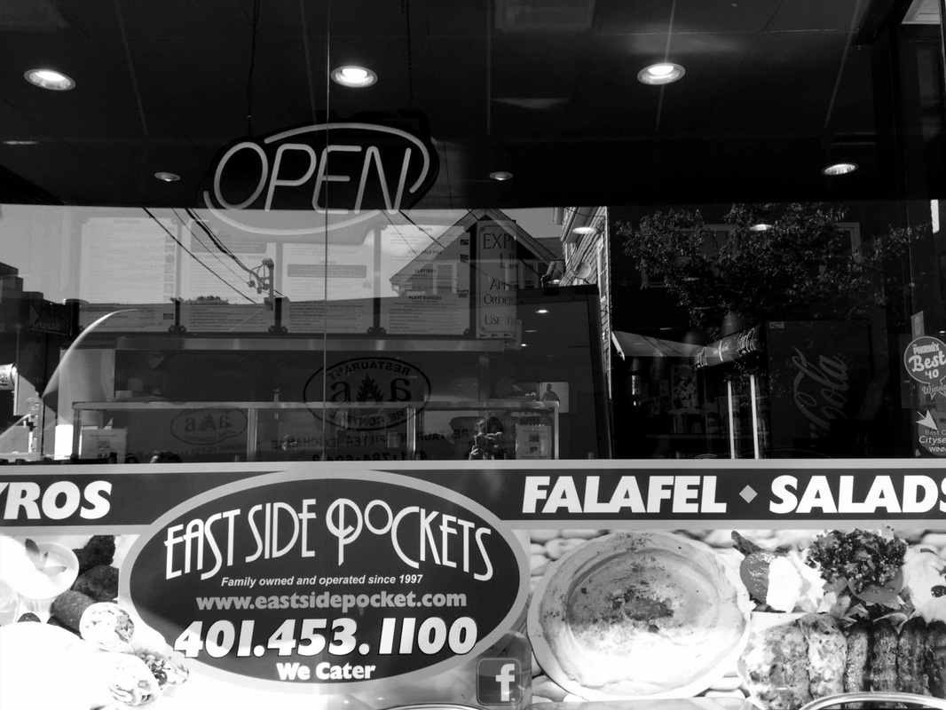
Thayer Street
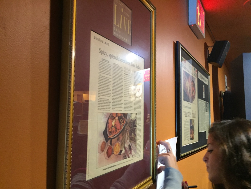
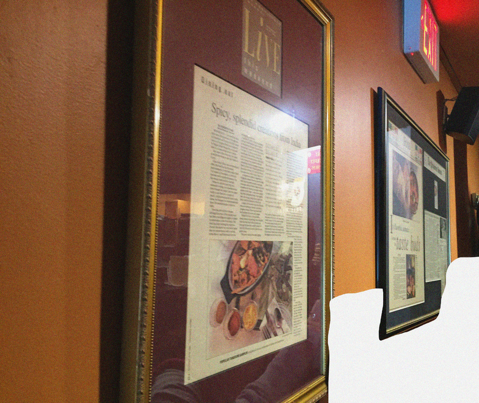
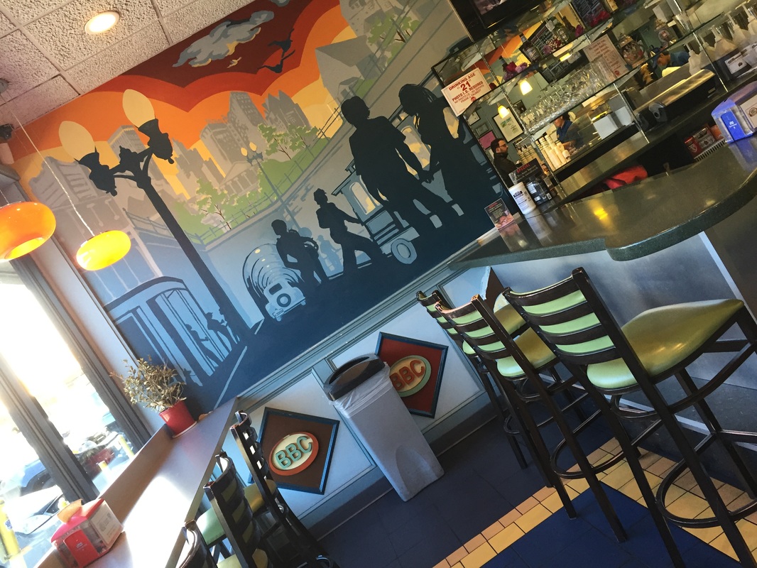
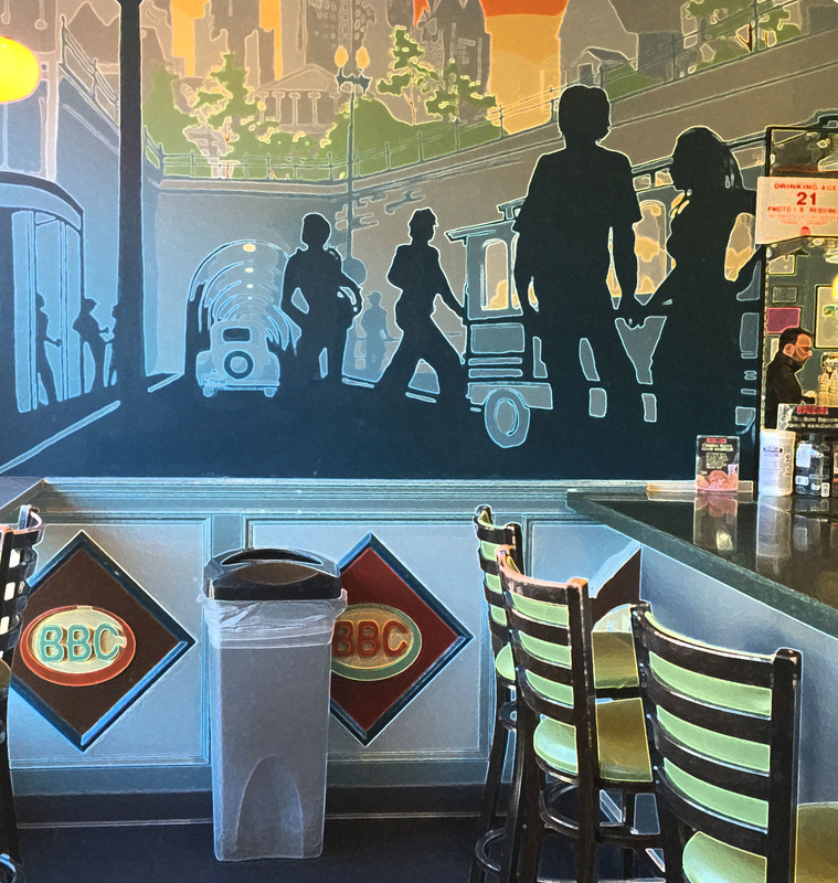
To be completely honest I don't now what I expected out of Thayer Street, maybe something really fancy. I didn't expect it to be a common everyday street for people who lived in Rhode Island. What it actually was wasn't disappointing, it seemed like a perfect street to hang out with friends and go out to relax for a day. I don't personally think this trip prepared me for the future. I plan on going into the music business as my career but making a brochure could come in handy for any ad designs to sponsor my music. I wish I could have went into more of the stores when we were finished and explore around a bit more. I could always go back with my family to explore or simply Google anything that I was interested in. The most memorable part of this field trip was meeting new people. It was cool to talk to the restaurant owners and explore their place to take pictures and look around. Thayer Street has several diverse restaurants and places to go and visit.
To be completely honest I don't now what I expected out of Thayer Street, maybe something really fancy. I didn't expect it to be a common everyday street for people who lived in Rhode Island. What it actually was wasn't disappointing, it seemed like a perfect street to hang out with friends and go out to relax for a day. I don't personally think this trip prepared me for the future. I plan on going into the music business as my career but making a brochure could come in handy for any ad designs to sponsor my music. I wish I could have went into more of the stores when we were finished and explore around a bit more. I could always go back with my family to explore or simply Google anything that I was interested in. The most memorable part of this field trip was meeting new people. It was cool to talk to the restaurant owners and explore their place to take pictures and look around. Thayer Street has several diverse restaurants and places to go and visit.
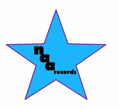
Record Label
This is the record label I decided to make for our upcoming project to make album art. It was very simple to make being. I used my initials for my name and Paint to make the star in the background. I then used different colors and a font I liked to make a label that looks good enough even when shrunken in size.
This is the record label I decided to make for our upcoming project to make album art. It was very simple to make being. I used my initials for my name and Paint to make the star in the background. I then used different colors and a font I liked to make a label that looks good enough even when shrunken in size.
