Photoshop Lesson
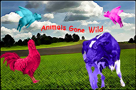
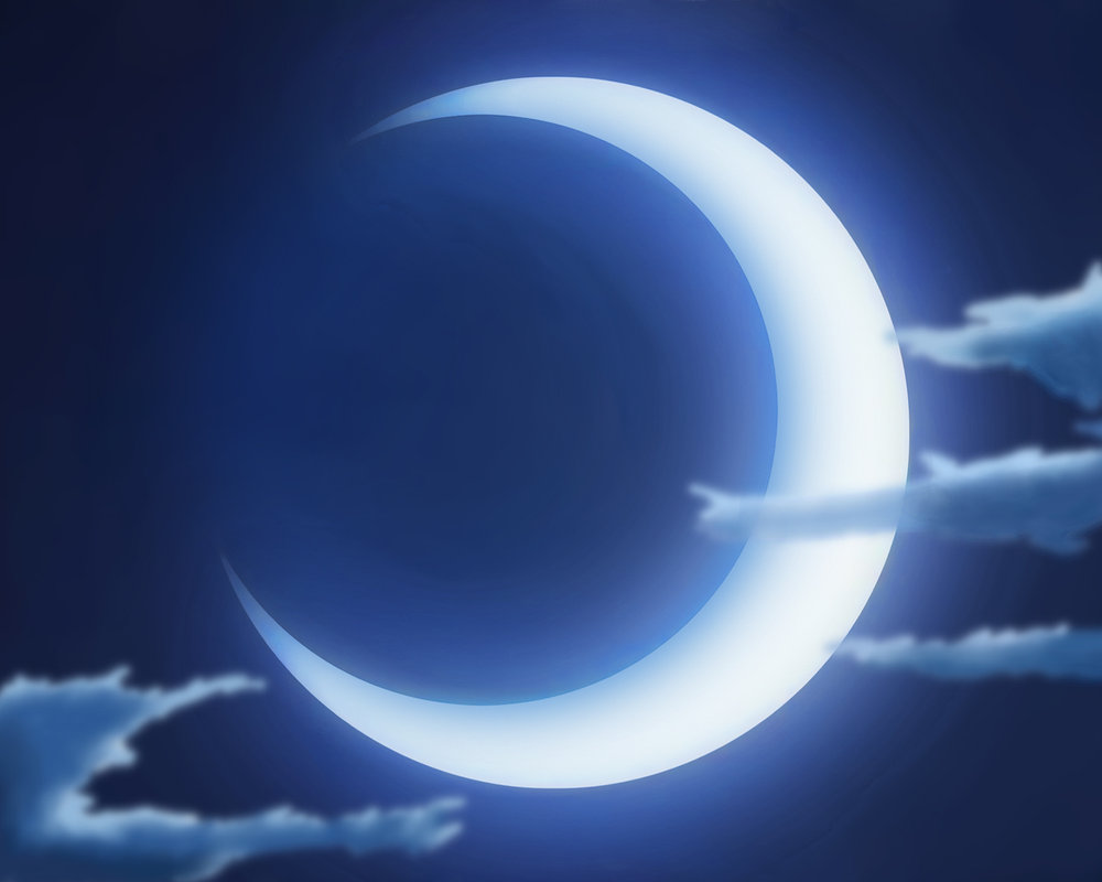
This is the outcome from the Photoshop lesson we had prior to the next album art project. we focused on the selection tools in the application.
This is the outcome from the Photoshop lesson we had prior to the next album art project. we focused on the selection tools in the application.
Glamor Shot
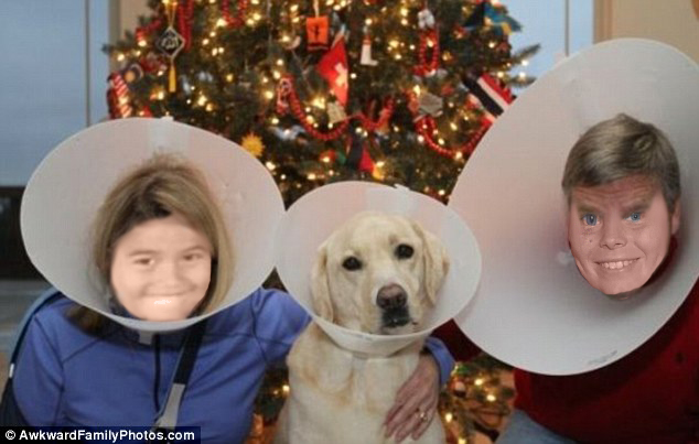
This is a Glamor Shot we made in class to learn more tools in Photoshop in preparation for our project.
This is a Glamor Shot we made in class to learn more tools in Photoshop in preparation for our project.
|
|
In C Album Art Cover and Back
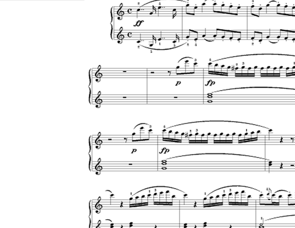
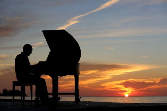
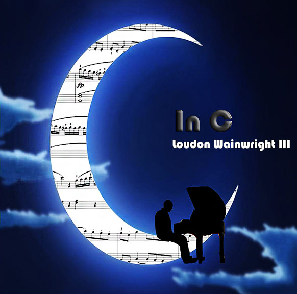
This is the album art cover and back I did for the assignment. I was given the song "In C" by Loudon Wainwright III. The song mentions of a piano and the song is played with a piano so I figured a piano should be an essential to the album art. Considering the song is in c and about playing in c, I looked up a random piece of sheet music which is in the key c. This sheet of music would become part of the moon. In order to do that I had to select the white moon and erase its color before placing the music behind the moon imagine to fill it in. I had also found a man playing the piano and decided to cut the both out separately only to reconnect them back by placing the man and the piano on the moon. The illusion is to make it look like he is sitting on the moon playing the piano. I personally like this cover because of how cool it looks. I had put a filter on it to make it sharper than it was before to make it look like it was actual moon light.
This is the album art cover and back I did for the assignment. I was given the song "In C" by Loudon Wainwright III. The song mentions of a piano and the song is played with a piano so I figured a piano should be an essential to the album art. Considering the song is in c and about playing in c, I looked up a random piece of sheet music which is in the key c. This sheet of music would become part of the moon. In order to do that I had to select the white moon and erase its color before placing the music behind the moon imagine to fill it in. I had also found a man playing the piano and decided to cut the both out separately only to reconnect them back by placing the man and the piano on the moon. The illusion is to make it look like he is sitting on the moon playing the piano. I personally like this cover because of how cool it looks. I had put a filter on it to make it sharper than it was before to make it look like it was actual moon light.
|
|
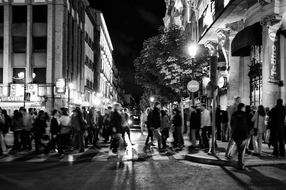
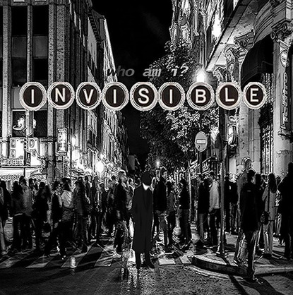
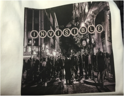
Invisible Album Art Cover
This is the song I had chosen to make a cover of. For the cover I wanted to make the street and crowd look busy and non caring. I wanted them to be bold yet in the background. I want the main guy to be acknowledged yet obviously duller and not as noticed as the background. This is why I chose to make the background's edges bold making everything in the back stick out. I chose the man to look cartoonish because the artist themselves like to have little characters for each song of theirs. This character is obviously noticeable and can be seen but by blurring him and making him stand in the street makes him look, as the song says, invisible. he is invisible to the people surrounding him. The words "invisible" is made out of old type writer keys because of the fact that in the song you can clearly here someone typing on an old type writer. Above those words is the phrase "who am i?" which is asked a lot in the song and his answer is that he is invisible to everyone to the point he doesn't even know himself. After I completed the assignment, I transferred it onto a white t-shirt using the Transfer Press in the back of the room. In order to do so, I had to flip my image and send it to the ink jet printer. After that was done, I put the image on my shirt, creating the end result as seen above.
This is the song I had chosen to make a cover of. For the cover I wanted to make the street and crowd look busy and non caring. I wanted them to be bold yet in the background. I want the main guy to be acknowledged yet obviously duller and not as noticed as the background. This is why I chose to make the background's edges bold making everything in the back stick out. I chose the man to look cartoonish because the artist themselves like to have little characters for each song of theirs. This character is obviously noticeable and can be seen but by blurring him and making him stand in the street makes him look, as the song says, invisible. he is invisible to the people surrounding him. The words "invisible" is made out of old type writer keys because of the fact that in the song you can clearly here someone typing on an old type writer. Above those words is the phrase "who am i?" which is asked a lot in the song and his answer is that he is invisible to everyone to the point he doesn't even know himself. After I completed the assignment, I transferred it onto a white t-shirt using the Transfer Press in the back of the room. In order to do so, I had to flip my image and send it to the ink jet printer. After that was done, I put the image on my shirt, creating the end result as seen above.
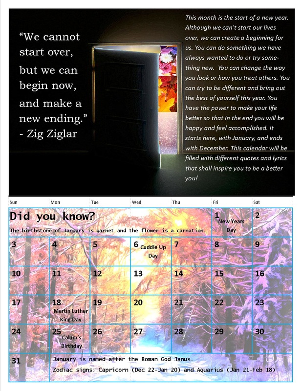
January
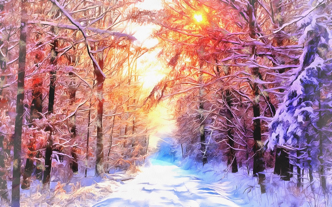
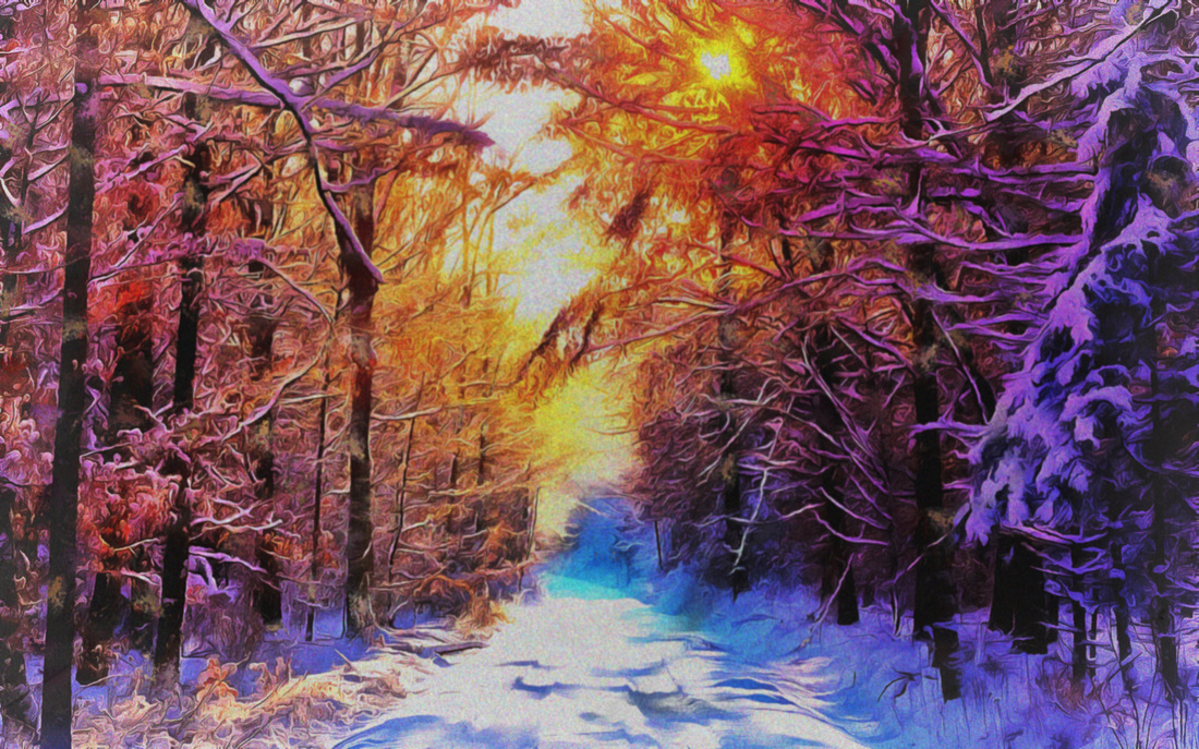
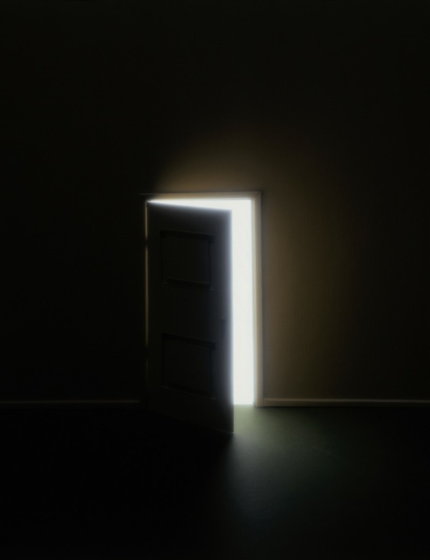
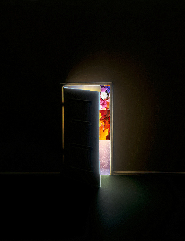
For this month, i had to first use a premade template to make the grid at the bottom. After setting up the dates, i copy and pasted it onto a blank page to begin my calendar. I found a pretty picture of a winter forest and decided to use that picture as the background to the grid. Using Photoshop, I made the picture darker so when i lightened it in Microsoft you would still be able to see the details and lighting. when i finished with the bottom half, i decided to use a door and put the elements behind the door to symbolize the new year. I then inserted the quote of the month, the little essay, and the facts onto my design. While doing this i learned how to make pictures different contrasts and brightnesses so you could be able to see the calendar grid and the picture.,
For this month, i had to first use a premade template to make the grid at the bottom. After setting up the dates, i copy and pasted it onto a blank page to begin my calendar. I found a pretty picture of a winter forest and decided to use that picture as the background to the grid. Using Photoshop, I made the picture darker so when i lightened it in Microsoft you would still be able to see the details and lighting. when i finished with the bottom half, i decided to use a door and put the elements behind the door to symbolize the new year. I then inserted the quote of the month, the little essay, and the facts onto my design. While doing this i learned how to make pictures different contrasts and brightnesses so you could be able to see the calendar grid and the picture.,
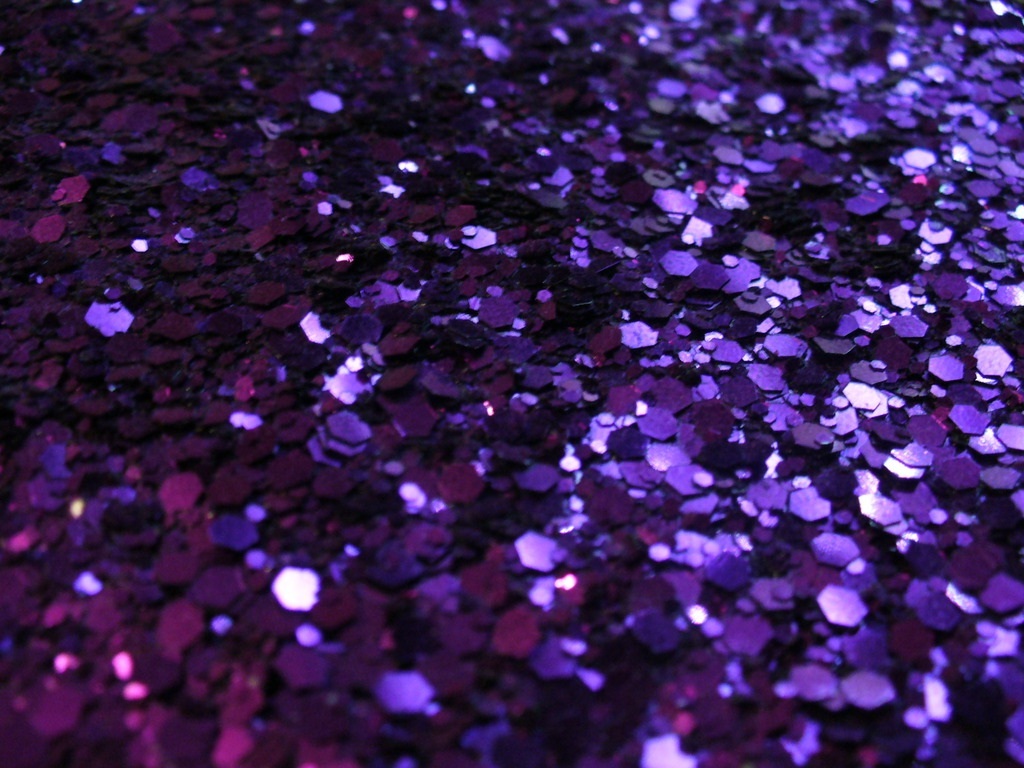
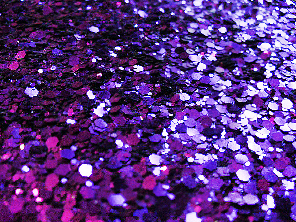

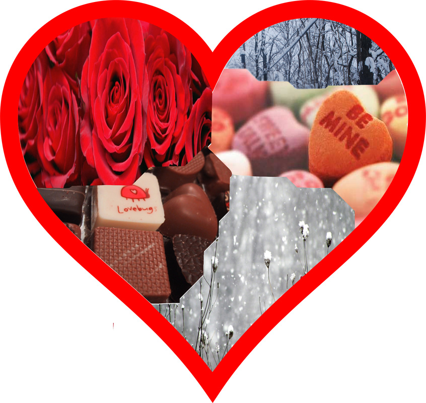

February
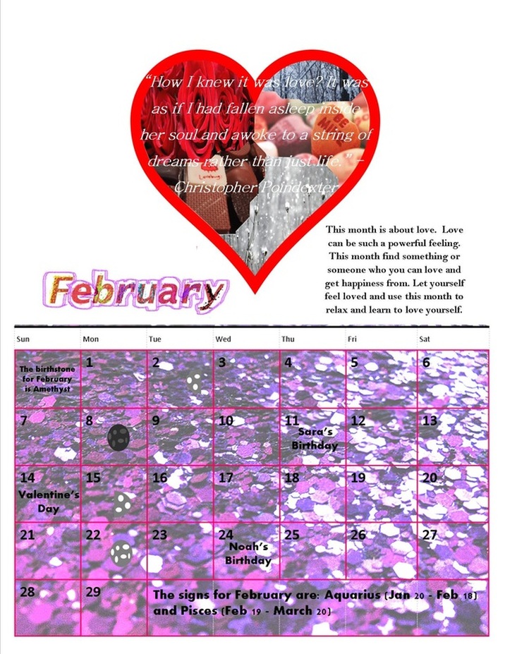
For this month I decided to use the colors purple and red. This month I focused on love since Valentine's Day is a big holiday in February. The first thing I did choose a background picture. I chose purple sequins and added sharpness and changed its filter in Photoshop. Then I found a red heart outline so I could make a collage within the heart. I chose pictures that remind me of February like snow, chocolate, flowers, and candy. I then used the magnetic tool to cut out different shapes from the picture and fit it within the heart. When I was done, I created my own word art. In Photoshop I simply typed in the month name, then I used the paint tool and colored in the letters with different colors using a dotted brush. I then filtered the text and finished it by outlining the text with a highlighter like brush. What I learned while doing this was how to create my own text for February in Photoshop.
For this month I decided to use the colors purple and red. This month I focused on love since Valentine's Day is a big holiday in February. The first thing I did choose a background picture. I chose purple sequins and added sharpness and changed its filter in Photoshop. Then I found a red heart outline so I could make a collage within the heart. I chose pictures that remind me of February like snow, chocolate, flowers, and candy. I then used the magnetic tool to cut out different shapes from the picture and fit it within the heart. When I was done, I created my own word art. In Photoshop I simply typed in the month name, then I used the paint tool and colored in the letters with different colors using a dotted brush. I then filtered the text and finished it by outlining the text with a highlighter like brush. What I learned while doing this was how to create my own text for February in Photoshop.
